Help Build the Science of Aging Timeline
Via Ouroboros, we learn of an interesting community project:
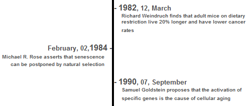
Paul House has started a project that should be of wide interest to Ouroboros readers: a Timeline of Discoveries in the Science of Aging. His goal is to facilitate the creation of a record of the major events in the history of (bio-)gerontology, and publish it in a visual interactive form that grows in response to user input. Clicking on an individual event along the timeline expands it into a full article....
The idea is for the site to be interactive in multiple ways - not only in the sense that the timeline is a clickable object that expands in response to user behavior, but also in the sense that user-generated content can be incorporated into the object itself. It's like a visual wiki.
So if you can think of a major event in the history of our field that belongs on the chart, visit the Science of Aging timeline and make an entry.
It looks much like this once it's going:
This has a lot of potential to develop into a helpful educational tool for advocates, I think. A visual timeline is a very intuitive way to show people that there is momentum in the field, and that work is being accomplished. For better or worse, people are much more likely to get behind and help push a wheel that is already rolling - and so the easier it is to show that aging research is rolling along and producing results, the easier it will be to attract more supporters.