Finally Redesigned
As you may have noticed, Fight Aging! now looks somewhat better than it used to. This major overhaul and redesign has been on my list for a very long time, but it seems to take a good few years for an idea to work its way through the pipeline into actualization around here.
Redesigning a website is a little more of a process than an event: with nearly 8000 posts and a variety of pages, it's a given that there are things lurking in the depths of Fight Aging! that now look worse than they did before. There will be a long list of minor tweaks and edits to make as I uncover the necessity for each. Equally, while I have made the best reasonable effort to ensure that Fight Aging! looks the same in every modern combination of browser and operating system, I'm sure there are one or two of you left with a slightly suboptimal experience.
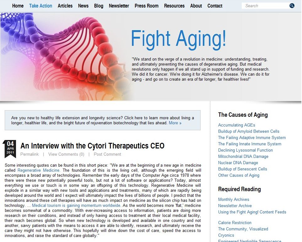
The first step to fixing issues is to let me know about them - if you see something out of place, the odds are good that it's not something I know about. Otherwise I'd have fixed it already. In particular, it would be good to know that visitors are all seeing the right condensed fonts in the header and the post titles. Custom fonts, and condensed fonts especially, are a horribly broken area of web development, and getting it right for everyone requires some fiddly work. Which should all be in hand and accomplished, but you never really know for sure until you meet that last edge case in person. What you folk should be seeing is shown in the image below - click for a larger version:
If that doesn't reflect what is on your screen now, then let me know.
In the course of working with the designer who put this present layout together, I obtained a good half-dozen variations on the theme: different color palettes, different header images, different navigation styles, and so forth. Now that the basic structure is done, swapping these themes in and out is just a matter of switching the stylesheets that declare the look and feel rules for the site. They are all good-looking variants, and it seems a shame to let them go to waste. So expect to see some changes and experimentation over the next few weeks, insofar as my time allows.
Ultimately I will place a small widget of some sort in the header that will let you choose whichever of the available themes you like the best, and that will be how Fight Aging! appears to you. We'll see how long that takes me.
really great redo Reason.. congrats on finding the time!
Looks great. If I can give one piece of constructive criticism, it's that it's currently very bright on account of the white background, which causes a strain on the eyes. It might be a good idea to change the color of the left and right borders to break it up a little. I would recommend a grey or off white along the lines of what's being used for the 'fight aging' logo above.